Have you ever wondered what your life would be like today had you invented a popular app such as Instagram, Snapchat, or even PokemonGo? Creating fun, mobile apps is easier than you think! Last night’s intro to iOS development presentation demonstrated just that. This MeetUp served as an introduction to the Swift programming language for beginners. The group started off by looking at the process of app development and then dove right in by creating a fully functional mobile app for the iOS by the end of the night.
The session was led by Patrick Sanders, an iOS expert and master teacher at TurnToTech. He taught 32 eager to learn attendees 4 lines of code to make a Magic 8 Ball app. Below you’ll find a step-by-step tutorial for building this app.
What we’re making.
We’re going to make the extremely popular fortune-telling device originally made by Mattel. The general idea being that you ask a question (e.g. “Will I ever become a billionaire?”) then shake the ball and an answer will appear.

Image Casey Fleser
Our app will look very similar and when you shake your phone a new fortune will appear on the screen.
Before we begin
In order to create iPhone and iPad apps you need:
– a Mac of a fairly recent year (computers built before 2006 wont work) with about 10 gigabytes of free space on the hard disk.
– an Apple ID (you probably have one if you have an iPhone or a Mac)
– Xcode – Apple’s development environment for Mac and iOS devices. You can download it in the Mac App Store. It can take quite a while to download and install depending on your internet connection and computer.
Getting started: creating a project
To get started we need to open Xcode. You can open it either directly from the Applications folder, clicking it in Launchpad or through Spotlight.
When you open Xcode you should see the following screen.

To create an iOS app we need to create a project. To do this either click “Create a new Xcode Project” in the above screen or by navigating in the menu bar to File > New > Project…
You should see this screen, which will help you choose a project template.

Xcode lets you choose between a variety of templates for iOS, watchOS, tvOS, and Mac. Today we’re creating an iOS app, so make sure you’ve selected Application under the iOS section of the left hand navigation menu (it is selected in gray in the above image).
For our app we’re going to use Single View Application. Select it and click next.
You should see this screen, in which we’ll enter information about our project.

For the project name we’re going to use “Magic8Ball”, but you could really use whatever name you want. For now you can enter whatever you’d like for Organization name and Organization identifier because they wont affect our project and can be changed later.
For this project we’re going to select Swift instead of Objective-C and for devices use Universal (which means it will work on both iPhones and iPads).
For this project we’re not going to use Core Data, unit tests or UI tests, so unselect those checkboxes if they’re selected by default.
Once your screen looks like the image above, click next.
You should see a Save file dialog box.

Choose a place to save your project (ideally where you can find it later), unselect the Create Git repository checkbox, and click Create
Getting around Xcode
Xcode is quite a complex utility and it can be overwhelming at first.

Lets break the workspace down into some sections to make it easier to understand.

The biggest and the part of the workspace you’ll use the most is the Editor. This is where you edit your app’s interface, settings and code.
The Navigator is where you can switch between the projects in your files, search for things in your project, etc.
The Utilities area is where you will see information about files and objects in your project. If you haven’t clicked anything else in the project, you should see information about your whole project there now (e.g. name, location of your project, etc).
The Toolbar is where you can see the status of your project (in the center), display and hide the Navigator and Utilties areas (far right), change the layout of the Editor (right) and run your app (left).
Finally there is one more area you don’t see now called the Debug area which appears when you run your app if there is anything printed to the log or if there are any errors while the app is running.
What’s in a project?
Take a look in the Navigator area, you’ll see some files that Xcode created for us that will serve as the basis for our project.

AppDelegate.swift
The AppDelegate file is the heart of our app and is written in Swift code. It receives events from the operating system (e.g. our app has been opened or closed) and then call other files in the project when these events occur. Every iOS project has one AppDelegate. We wont be changing anything in this file for this project.
ViewController.swift
View Controllers control what is displayed on the screen (e.g. buttons, images, videos, text, etc), as well as user interactions with things on the screen (e.g. tapping a button with your finger, shaking the device, rotating the device, etc). A project can have many View Controllers, but our project will only have one. This file is also written in Swift.
Main.storyboard
A storyboard is a visual way to create and edit the interface of your app without writing any code. This makes creating simple apps much simpler. A single storyboard can link to many different View Controllers and make it easy to switch between them. Storyboards may be the easiest, but are definitely not the only way to create interfaces (you can also make them with code or XIB files).
The Main.storyboard file will appear as soon as our app has finished launching. It is connected to the ViewController.swift file by default.
Assets.xcassets
This is a file that makes it simple to store and organize binary files (e.g. images, videos, icons, etc) in your project.
LaunchScreen.storyboard
This storyboard appears while your app is opening. We might not even see it for this project, because it is very simple and should launch quickly. We wont be making any changes to this file.
Info.plist
plist stands for Property List and is where essential configuration information about our project is stored. We wont be making any changes to this file.
Products
This group shows any of our project targets (e.g. the built app) you should see a file called Magic8Ball.app if you expand it. Clicking it wont open anything in the Editor.
Running our app
At this point, we have a fully functional (though rather uninteresting) app, so lets test it in the iOS Simulator included with Xcode. In the Toolbar you’ll see some buttons on the left that let us run our app on the iOS Simulator and physical devices.

For now we’re going to run our app in the iOS Simulator (later we’ll run it on your own device if you have one). If everything looks like the picture above, click the Play button and Xcode will build your project and then open the iOS Simulator (you should see this icon appear in the Dock)

The simulator window will likely appear above the Xcode window, if not click the Simulator icon in the Dock. Confusingly enough, you will probably see a black screen when the simulator first opens, which may be visible for quite a while depending on the speed of your computer.

What you’re actually seeing is the very top and zoomed part of this:

Which is the very familiar iOS booting screen. But only seeing the very enlarged top part of the iPhone screen is probably not useful, so lets change the zoom so we can see the whole screen.
This can be done in the menu bar by going to Window > Scale and choosing a scale that will make everything fit on your screen (For me 33% is perfect, if you have a smaller laptop maybe 25%, or 50% if you have a giant screen)

Once the simulator boots, your app should open, and you’ll see a white screen. This is what you should see, since we haven’t added anything yet.

Getting the look right.
Lets get started with our interface which we will do primarily in the Main.storyboard file, so lets open it. In the Navigator area (the left side bar) click Main.storyboard (a single click will work, though it may take a minute to load the first time you open it)
Should look like this when it opens:

This screen is called Interface Builder and it has two parts. On the left we see the Document outline, this lets us see all of our buttons, text, images, etc in a tree format, which can be very useful for selecting the exact element we want to interact with (especially when it’s near/on-top-of/behind other elements) On the right we see our interface editor, it is essentially what you would see on your phone (even though your phone isn’t a square).
What’s the arrow?
The arrow that you see pointing to your interface actually means “When the app opens, go to this interface” aka ‘Storyboard entry point’
Let’s get started…
The first thing that is wrong is that a Magic 8-Ball is of course black and not white. To do this click anywhere in the big square in the center of the editor (except the top bar). The border will change color to black, the Document outline will also expand and show the selected element. You can also select that view by selecting it in the Document outline.
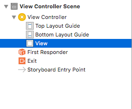
The contents of the Utilities area should change and look like the following:

Though a lot of the options in this menu might not make sense to you. You should be able to find and change the background to Black Color with ease.

Click the text or the blue arrows to get a drop down of common colors, or the rectangle filled with the color itself to get a color picker. If you want, you can run your app and the background color should change.
Next, it’s unclear what this app does, so lets create a label to tell the user what to do. In the bottom of the Utilities area there is a small area that holds different libraries for us to use.

 File template library
 Code snippet library
 Object library
 Media library
Click the Object Library button and find Label (you can use the search bar at the bottom to find this faster than scrolling through the list)

Now, here’s the real magic click, hold and drag Label from the library to your view. Ideally we want it near the top and in the middle. Guides will appear to help you place things in the center and away from the menu bar.

To change the text in the box, double click the label and it should select the text. Type “Ask a question, then shake your phone” in the label and press ‘enter’.
 … then …

After you click enter, you may notice it’s no longer aligned nicely in the center. Drag it back to the snap point.
Now we’re going to prevent it from moving again (and make it so it’s centered in any size device) Select your label so it has the six squares around it (as in the picture above). Then look for these icons in the bottom right corner of the editor.

Click the second from the left (Align) and a menu will pop up. Select Horizontally in Container. Leave the number at 0. Then click Add 1 constraint. This will keep our label centered.

You should notice a red vertical line appear and the border of our label turn red.

Next we want to our label to always stay near the top of the screen, so we’re going to add a different type of constraint.
This time we’re going to click the second icon from the right (Pin).

Click the dotted “I”. This tells the label that it should be pinned to the object above it (in this case 8 points from it). Once it looks like the object picture above, click Add 1 constraint..

You should notice a little “I” with the cross bars appear as in the above image.
Next we’re going to add another label that will show the name of our app in big letters. This time at the bottom of the screen.
Go back to the Object Library in the bottom right corner, select another label and drag it to the bottom center of the screen. Double click it and change its value to “Magic 8 Ball”.

Now let’s change the value of the text to be larger and stronger. Click the label. In the Utilities area you should see the following.

Click the  and you will see a menu of font options for your label.
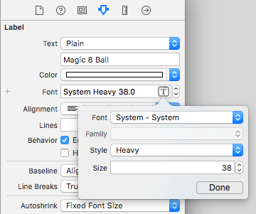
We’re going to change the font size to 38, and the style to Heavy which will make it bolder. Then click done.
In the Utilities area we’re also going to align text center. This will align the text inside the label box (not on the screen like above)

You may notice that your text isn’t completely visible now.

To fix this, click and drag one of the squares at the corner. This will expand the label’s frame.

You may notice, if you expand the box to be bigger than size of the text, that the text stays centered in the box (that’s because we aligned the text to the center before)
Just as we did before with the label at the top before, set it to be centered using the align menu. Then instead of pinning it to the top of the screen, we’re going to pin it to the bottom. As shown below. Remember to click Add 1 constraint


Note: The dotted box that you see above, shows that there is a difference between what you see in the preview and what will appear when the app runs. In our case it doesn’t matter, because the phone will just shrink the box to match the size of the text
The app should run now without any errors and look like this:

Now we know what the app should do and what it’s called, so now it’s time for the real magic. We need to have a blue triangle where our fortunes can appear.
Download the following image. We’re going to use it next.

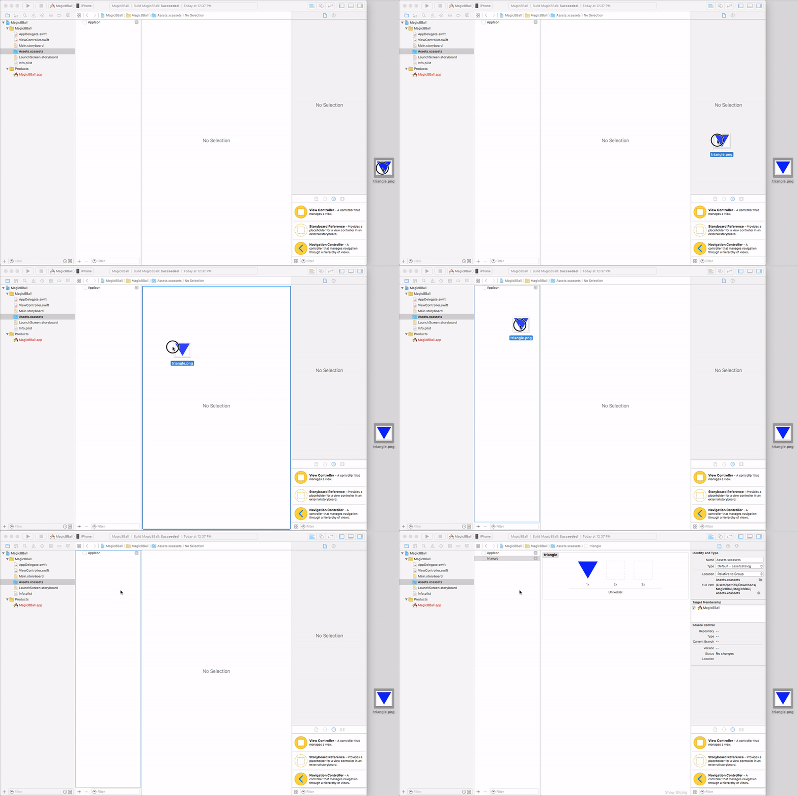
Then we need to open the assets catalog in the Navigator of Xcode.

Next, drag the image you downloaded into the left panel of the assets catalog.
Next open Main.storyboard again. We’re going to make a place for the image in our storyboard. We’re going to go to the Object library (the same place we got our labels) and find an Image View
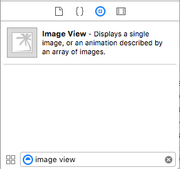
An image view is a container that holds a photo. Right now our container is empty. We’ll add the triangle to it in a minute, but first lets change it to be the size we want. In the lower right corner of the Editor click the Pin icon ![]()
Click both the height and width buttons, and enter 300 for each. Click Add 2 Constraints

Now we’re going to set the image view to stay in the center of the screen. First drag it to the center so the horizontal and vertical dotted lines appear.

Now we’re going to align it to be both horizontally and vertically aligned in the screen.
Next click the align icon in the bottom right hand corner of the editor and click Horizontally in Container AND also Vertically in Container then click Add 2 Constraints
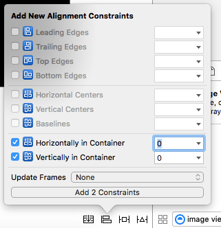
Solid lines should appear when the image view is selected.

With the image view selected, in the Utilities area we are going to switch to the Attributes inspector 
You should see this.
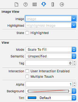
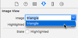
If you click the blue arrow next to the Image field you should see our triangle image in the list. Select it.
The triangle should appear in your image view almost immediately. If you run your app now, it should look like this.
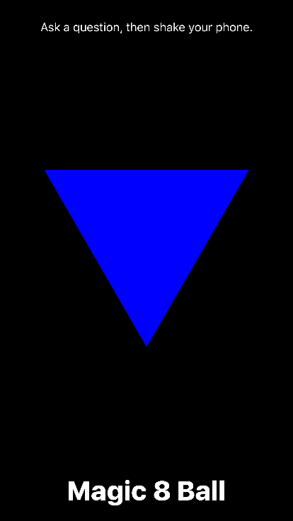
Great, only one more feature to add, we need a place for the fortunes to appear in.
From the Object Library we need to drag in a Text View and resize it to being mostly contained in the triangle (since that’s where the fortunes will appear) Mine ended up being about 200 pixels wide by 125 tall.
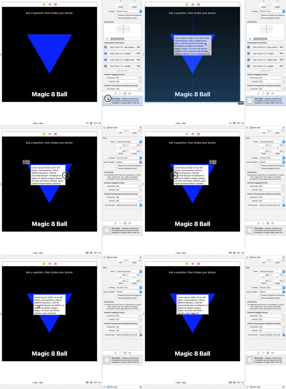
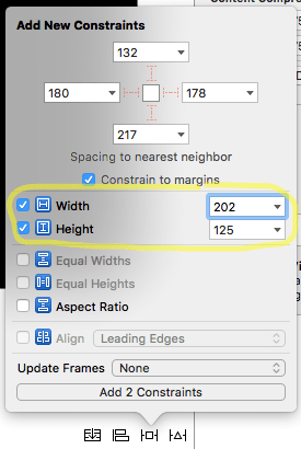
Now in the Pin ![]() menu, we need to lock the size of our text view. This time, we only need to check the width and height boxes, we don’t need to set the values, because we chose them by dragging the corners of the text view. Click Add 2 Constraints
menu, we need to lock the size of our text view. This time, we only need to check the width and height boxes, we don’t need to set the values, because we chose them by dragging the corners of the text view. Click Add 2 Constraints
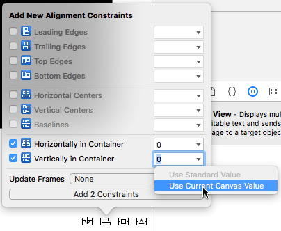
Now we need to align our text box to stay in its place above the triangle. With your text view selected, click the Align icon ![]() . Then select Horizontally and Vertically in Container as we have done before. However this time, we are going to change the value of Vertically in container because we actually want our text field to be offset to be vertically higher than the center (towards the big end of the triangle). Click the arrow in the Vertically in container field and select Use Current Canvas Value.
. Then select Horizontally and Vertically in Container as we have done before. However this time, we are going to change the value of Vertically in container because we actually want our text field to be offset to be vertically higher than the center (towards the big end of the triangle). Click the arrow in the Vertically in container field and select Use Current Canvas Value.
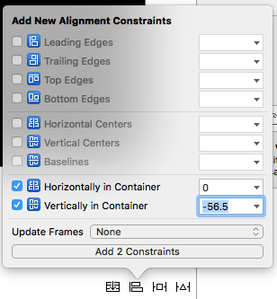
It should automatically enter a value (hopefully) between 50 and 60. Then click Add 2 Constraints
If you run your app now, you should see the following:

Now lets remove the “Lorem ipsum” text, change the font, get rid of the white background and make our text bigger and white.
First lets remove the white background. In the Utilities area, select the Attributes inspector ( ) Then scroll down to the View section (it is the last section). You should see a Background dropdown. Click the text or the arrows and choose “Default”
  (the top one). This will turn your text view background transparent.
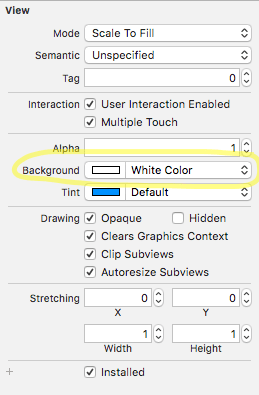
Next, scroll the attributes inspector back to the top. You should see the Text View section.
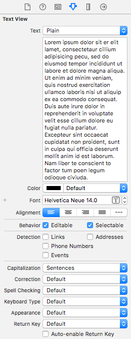
First lets change the Color to White. Next lets change the font from Helvetica Neue 14.0 to Helvetica Neue Bold 30.0. Select Center align and uncheck Editable (since we don’t want our users to change their fortunes).
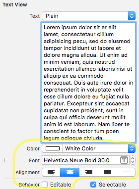
As you do this the text in your view should change size, color, style, and alignment. Next delete all the of Lorem ipsum text (we’ll set the text later when the user shakes the phone.)
Next we need to connect our Main.storyboard with ViewController.swift this will let our view controller change our interface (change the text) when it receives an event (the phone is shaken).
To do this, we need to change the editor to Assistant Editor mode, which will show two files side by side. To do this click the Assistant Editor button in the top right corner of the tool bar.
![]() – the two circles
– the two circles
You should then see Main.storyboard open on the left and ViewController.swift open on the right. If it’s too crowded you can hide the Navigator and the Utilities areas by clicking the left and right buttons in the upper right corner 
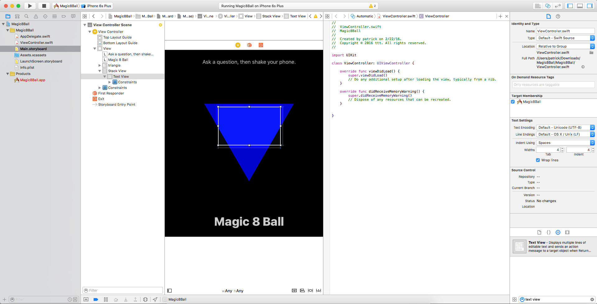
Now we need to create an outlet from out storyboard to our view controller. To do this we select our text view in the storyboard, then click and hold control on the keyboard, and drag to the line class ViewController…* and override func…
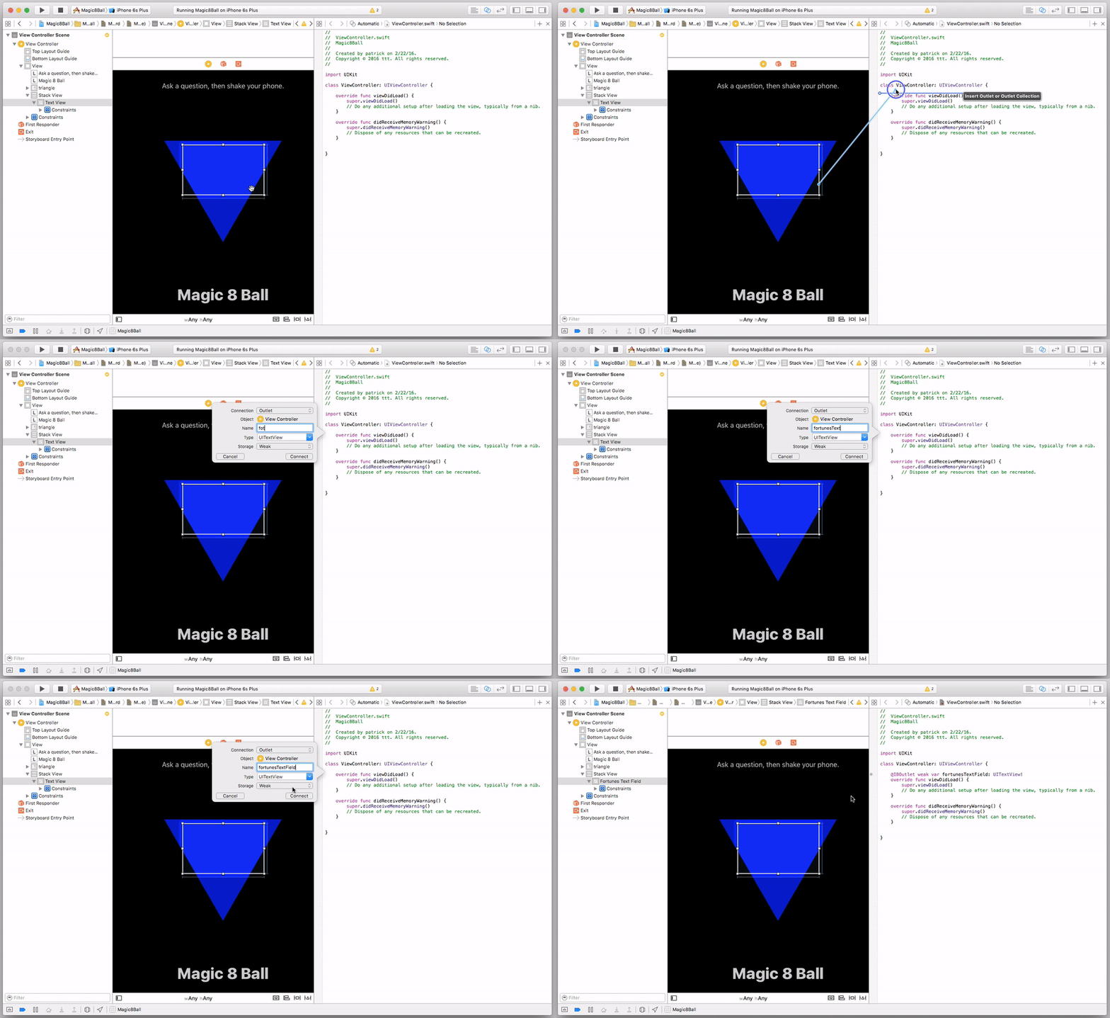
A popup will appear and we want to name our outlet fortunesTextField all the other settings are find as they are. Click Connect

In your ViewController.swift file you should now see a line of code that looks like this:
@IBOutlet weak var fortunesTextField: UITextView!
Now lets switch back to Standard editor (e.g. not two documents side by side). Click the Standard editor button.
![]()
And let’s open the ViewController.swift file in the Editor. It should look like this.
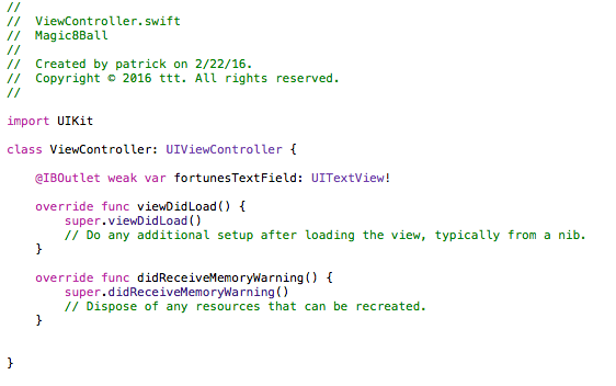
The first thing we need to do is add the following code after the line that starts with @IBOutlet
override func canBecomeFirstResponder() -> Bool {
return true
}

This code allows us to receive touch and gesture events. Otherwise they would be sent to some other part of the system by default. We need this or the event that is created when you shake the phone will bypass our app and it will be as if it never happened.
Next we need to add our fortunes. We’re going to create an array (think of this as a list for now) that contains all of the possible outcomes. To do this we want to add this:
var fortunes = [“yes”,”no”,”outlook not so good”]
I’m adding this under the line that starts with @IBOutlet.
This creates a variable (var) with the name fortunes that holds an array (think list) of different possible fortunes. We have three possible outcomes now, but we could add as many as we want by just putting another comma, then adding another phrase in quotes.
Finally we need to create a function that will receive motion events, see if the motion event is a shake, and then randomly put one of our fortunes into the text view.
override func motionEnded(motion: UIEventSubtype, withEvent event: UIEvent?){
if motion == .MotionShake {
self.fortunesTextField.text = self.fortunes[random() % self.fortunes.count].uppercaseString
}
}
This function overrides a built in function that listens for motion events ending (First line). Then it looks and sees if the motion event was a shake (Second line). Then it gets a random value, and gets a fortune from our array (Third line). Finally it makes the text uppercase (the end of line 3)
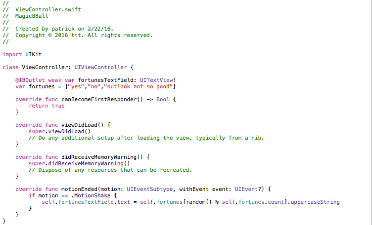
When we run our app we should see:

Since we’re using a simulator, we can’t actually shake something to see if this works. But the simulator includes a Simulate shake option.

If everything works correctly, you should see one of the fortunes you entered appear in the triangle, like below.
“Will I win the Power Ball?”


